Why bother to reduce energy consumption
This blog entry is part of a series of posts introducing the topic of smart meter disaggregation. This specific post looks at the wider reasons for reducing energy consumption. In other words, this post explains some of the reasons which keep me up at night when I’m not distracted by work! The reasons for reducing energy consumption typically fall into one of two categories: financial and environmental. We’ll focus mostly on the consumption of electricity but the arguments are mostly applicable to the consumption of all sorts of energy.
Financial reasons
There’s been a lot of coverage in the press recently about high energy prices. In January 2012, for example, the Citizens’ Advice Bureau stated that 43% of people are worried that they can’t afford their next fuel bill. The following plot shows average annual domestic electricity prices in the UK from 1994 to 2011 (data from DECC, 2011).
Electricity prices have risen from 2004 to today; but, when compared to data from the 1990s, today’s prices are not quite as earth-shatteringly high as some news papers would have us believe.
What has caused the 35% price rise (in real terms) from 2003 to 2011? I’m no expert but let’s discuss two datasets which shed some light on what’s going on.
Global energy consumption trends
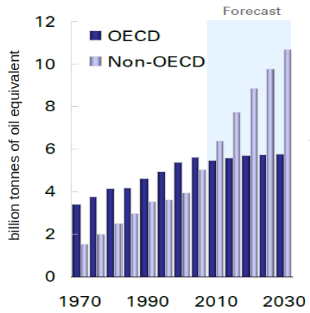
We’re probably all aware that global demand for energy in increasing but, until I looked at the data, I was unaware just how quickly world primary energy demand is increasing:

(Plot of World Primary Energy Demand taken from BP Statistical Review of World Energy 2011)
A striking feature of the graph above is that energy demand from non-OECD countries has increased by more than 50% over the past ten years; and the good folks at BP think this trend will continue for the foreseeable future.
In 2000, China used half as much energy as the USA. In 2009, China overtook the USA to become the world’s largest energy user (IEA, 2010). The International Energy Agency projects that Chinese consumption will increase by 75% between 2008 and 2035, and that Indian energy consumption will more than double over that same period (although India will still consume less energy in 2035 than either the USA or China) (IEA, 2010).
Even if the geology can keep up (which is questionable), it will require enormous amounts of investment to quench the every-increasing thirst of countries like China and India. It is almost inevitable that demand from non-OECD countries will exert considerable upward price pressure on energy.
As a side note: in a recent LSE podcast on “State of the World Economy in 2012”, Jean-Michel Severino (inspector general at the French Ministry of Finance) noted that one of the distinguishing features of the current global economic slow-down is that commodity prices have remained high. In previous world economic slow-downs, Severino noted that commodity prices have acted as a kind of “buoyancy aid”: the economy slows, which in turn decreases demand, which reduces commodity prices, which makes it easier for the global economy to consume commodities and hence grow again. This time around, commodity prices have at best plateaued and many have actually increased despite most of the western world experiencing low or even negative growth.
UK energy trends
The UK is especially exposed to energy price rises. The UK makes extensive use of natural gas for heat and power generation. Between 1995 and 2004 the UK was not just self-sufficient for gas but it was a net exporter of natural gas pumped from the North Sea (BP, 2011). Gas production from the North Sea peaked and began its terminal decline in 2000 hence the UK has been a net importer since 2004 (BP, 2011), requiring us to buy increasing amounts of gas on the volatile global market. Gas production from the North Sea halved between 2000 and 2010 (data from BP, 2011):
Recent research suggests the UK may have substantial “unconventional” gas reserves in the form of on-shore shale gas. The British Geological Survey believes the UK may be sitting on 150 billion cubic meters (150 × 10^9^ m^3^) of shale gas (BGS & DECC, 2011). However, to put this into perspective, the UK consumes 100 billion cubic meters of gas per year, so our shale gas reserves will not fundamentally change our energy mix (unlike in the USA where shale gas has been a “veritable game changer”: shale gas currently accounts for 23% of US gas supply and is projected to grow to 40% by 2030 (FACTS, 2011)).
Environmental reasons for reducing energy consumption
The production of electricity also has environmental costs. In 2010, 75% of the UK’s electricity was produced from hydrocarbon-fired power stations (DECC, 2011), producing 191 million tonnes of CO2. This represents 39% of the UK’s total CO2 emissions, making electricity generation the largest single source of CO2 in the UK (DECC, 2011). The domestic sector is the single largest load on the electricity grid, accounting for 31% of the UK’s electricity demand (DECC, 2011). Whilst there has been increasing media attention on CO2, it is worth briefly considering some peer-reviewed evidence not least because media coverage of the issue is often more noise than signal.
Human activity worldwide currently produces 29 billion tonnes of CO2 per year (IPCC, 2007). Since the industrial revolution began in 1880, atmospheric CO2 concentration has increased from 280 parts per million to 391 ppm in 2011 (NOAA), higher than any time during the last 800,000 years (Luthi et al, 2008), and likely higher than any time in the past 20 million years (Pearson et al, 2000) (to put this into some context: anatomically modern humans are hypothesised to have first appeared around 200,000 years ago (McDougall et al, 2005) and agriculture began around 10,000 years ago (Gupta, 2004)). This increased CO2 concentration has two main detrimental effects on the environment: it enhances the “greenhouse effect” (Wood, 1909; IPCC, 2007) by reducing the rate at which the planet loses infrared radiation into space and it acidifies the oceans (Caldeira et al, 2003; Orr et al, 2005), damaging marine ecosystems.
There is a considerable body of evidence indicating that the world’s systems are already changing. For example: the amount of infrared radiation emitted from the top of the atmosphere into space is decreasing (Harries, 2001) (consistent with the hypothesis that increased atmospheric CO2 concentration scatters more IR back to earth’s surface), global land-ocean temperatures increased by about 0.8°C over the period 1880 to 2010 (GISTemp):
Ocean heat content is increasing (Schuckmann et al, 2009), Arctic sea ice is decreasing in extent (Johannessen & Ola, 2008) and volume:
The Arctic sea ice loss is unexplainable by any of the known natural variabilities (Polyak et al, 2010). If this trend continues then we will see an ice-free summer Arctic within the next 30 years (Wang & Overland, 2009). Mean total Arctic ice volume was about 15,000 km^3^ from 1979-2010; so a y-axis value of about “-15” on the graph above corresponds to zero ice volume.
The Greenland and West Antarctic ice sheets are losing mass (Cazenave, 2006), the tropical belt is widening (Seidel et al, 2008), plant populations are moving to higher altitudes (Lenoir et al, 2008), seasons are starting earlier (Stine et al, 2009), sea level rose 195mm between 1870 and 2004 and the rate of sea level rise is accelerating (Church & Neil, 2006).
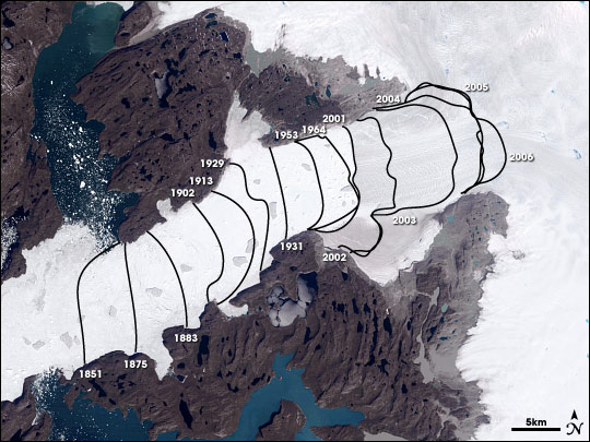
The following image shows the retreating calving front of the Jacobshavn Isbrae glacier in Greenland from 1851 - 2006 (Nasa Earth Observatory):
Projections for future climate come with considerable uncertainty but ensemble modelling suggests that, if we continue on current emissions trajectories, the world is likely to warm by at least 2°C by 2100 and possibly by as much as 6°C (Rockstrom et al, 2009; IPCC, 2007). (To put this into perspective, the difference in mean surface temperatures between an ice-age and an interglacial is about 6-8°C). This warming is likely to have many adverse effects, not least of which are the desertification of many currently arable areas (IARU, 2009) and a probable sea level rise of 0.75 to 1.9 meters by 2100 (Grinsted et al, 2009; Vermeer & Rahmstorf, 2009; Rignot et al, 2011). Palaeoclimatology studies and modelling suggest that many of these effects are likely to worsen over subsequent centuries and will be irreversible for at least the next 3,000 years (Solomon, 2009; Rockstrom et al, 2009). (For a recent review of climate science, see IARU, 2009.)
What effect might this have on humans? Human technological evolution over the past 10,000 years has taken place in a remarkably stable climate. The graph below (adapted from Petit et al, 1999; also see Rockstrom et al, 2009) shows a history of earth’s surface temperatures for the past 420,000 years. Note the unusually narrow temperature range for the past 10,000 years:
(A history of surface temperatures for the past 420,000 years. Adapted from Petit et al, 1999)
It has been proposed that this stable climate aided human societal development (Dansgaard et al, 1993). Unfortunately, paleoclimate data also demonstrates the stability experienced over the past 10,000 years is the exception rather than the norm (Dansgaard et al, 1993) and that human emissions may push the climate away from this stable state (Rockstrom et al, 2009) into a state never experienced by the human species, let alone our 21st-century infrastructure.
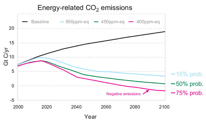
Is there a “safe” amount of warming? At the 2009 United Nations Climate Change Conference in Copenhagen, 138 countries signed an agreement (the “Copenhagen Accord 2009”) stating that actions should be taken to keep the temperature increase below 2°C. The 2°C target is a compromise. Even with just 1.5°C of warming, it is extremely likely that low-lying islands will be submerged. But temperature increases above about 2.5°C could initiate the total melting of Greenland’s ice sheet (IARU, 2009) which contains enough water to raise sea levels by 7 meters (ACIA, 2005). By how much do we need to reduce emissions in order to provide a reasonable chance of keeping warming below 2°C? The following figure (taken from IARU, 2009) illustrates that, if we want a 75% chance of limiting warming to 2°C then global emissions need to peak by 2020, decline rapidly and then go negative in 2070! (The exact shape of the lines in the graph below are a little arbitrary; the climate cares about the area under each line, which is proportional to the total mass of CO2 in the atmosphere (CO2 has an average lifetime in the atmosphere of around 100 years)). It’s an extremely tough challenge. Note that the analysis represented in the following graph shows that we have to start to reduce emissions within the next few years; the longer we wait, the steeper (and hence more expensive) the reductions need to be. Even if we start to reduce emissions in 2020, we still need a 10% year-on-year decline in emissions, which is historically unprecedented (global emissions are currently increasing by about 3 or 4% per year). If there’s a single graph which keeps me up at night, it’s this one:
Yes, very steep decreases in CO2 emissions are required, but it’s important to note that reductions are not completely unprecedented. The UK, for example, reduced its emissions by around 20% between 1990 and 2011 (see the graph of emissions in this Guardian article). This reduction is probably largely due to the UK’s “dash to gas” (when we displaced some coal-fired power generation with natural gas generation, which produces slightly less CO2 per unit of electrical power1{#footnoteref1_f95zwl2 .see-footnote}) and us effectively off-shoring heavy industry to other countries.
-
1.{.footnote-label} although methane leaks during production may offset climate benefits of natural gas (Tollefson, 2012)


