Visualisation and Analysis of Domestic Electrical Energy Consumption
Imperial Computing Science MSc Group Project Proposal, November 2012
The challenge
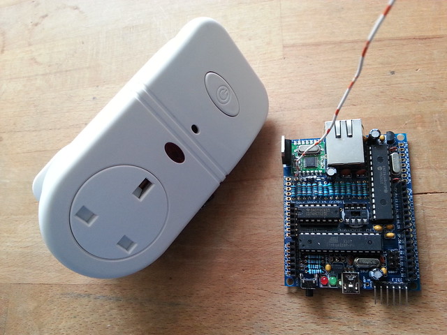
As energy costs increase, there is increasing pressure to use energy as efficiently as possible. The first step towards reducing energy consumption is often to measure your existing consumption. To this end, millions of people have installed home energy monitors like this one from Current Cost:

Furthermore, by the end of the decade every home in the UK will have a "smart meter" which will digitally measure energy consumption.
The aim of this project is to help solve two challenges:
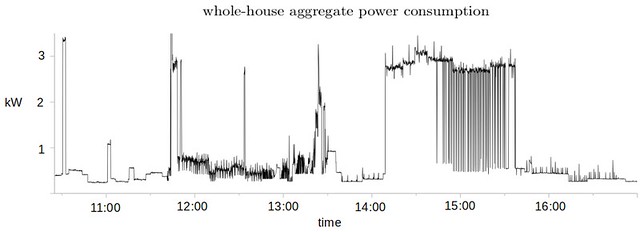
One challenge is that data from energy meters is not trivial to interpret, hence energy data is rarely exploited to its full potential. For example, if you were given the graph below could you decide what action to take in order to reduce energy consumption? I know I couldn't!
A second challenge is that there is very little open-access power meter data available to help the research community build better visualisation tools and disaggregation algorithms (disaggregation automatically estimates individual appliance energy consumption from a whole-house meter signal). The research community is hungry for more data.
Two aims of this project
1) Data Visualisation and Analysis Tool
One aim of this project is to produce an attractive, easy-to-use and powerful data visualisation tool to help users understand their own energy consumption data. The raw data might be from whole-house meters, individual appliance monitors or appliance load estimates generated by disaggregation algorithms.
The technologies used to implement these features is your decision but you may like to consider building a web app using modern web technologies like HTML5, SVG, JavaScript and frameworks like d3.js. Web apps have the significant advantage that they can be accessed from a wide range of devices (Windows PCs, Macs, Linux boxes, phones, smart TVs, tablets etc), hence maximising the potential target audience. If your project is successful then we can pay for a web server to take your project "live" (which would be a great project to link to from your CVs).
Exactly which features you implement will be up to you. Some candidate features for your consideration are listed below (and these really are just suggestions. You can implement whatever you want; and you certainly wouldn't be expected to implement all of these features!). Some of the feature suggestions below include questions for research:
- Make it easy to explore energy data by allowing users to zoom and pan timeseries graphs using a similar interface to Google Maps. This is likely to involve caching data locally in the browser, pre-emptively pulling data from the server, only loading data points that will actually be plotted for the current zoom setting, smoothly animating transitions, intelligently picking x-axis tick mark positions etc. Some questions: Would users like to be able to zoom both axes or just the x-axis? Are Google Maps key-bindings the most intuitive? (Here's an example of a zoomable graph built with d3.js.)
- Some machine learning problems you could try, if you fancy it (this is by no means an exhaustive list):
- If you have time then try your hand at disaggregating whole-house signals (it's not easy!) If you're interested then here are two papers which, in some sense, represent the "classic" approach and one of many "state of the art" approaches:
- Hart 1992 describes the pioneering work done by the "godfather" of disaggregation, George Hart. His main algorithm might well be something that you guys could have time to implement if you're lucky (and, as an aside, re-implementing George Hart's algorithms would in itself be a really valuable contribution. At present there are no open-source disaggregation systems; which is problematic for a wide range of reasons. One reason is that it's currently impossible to compare the performance of today's algorithms with George Hart's algorithms. In other words; we simply don't know if the field has progressed since the '90s or not!)
- The second paper is Kim et al 2011. Kim et al used several varieties of Hidden Markov Models to automatically learn appliance profiles.
- You could try to predict a user's quarterly energy bill based on their usage so far this quarter, their usage in previous quarters and other peoples' usage.
- Remove seasonal trends from data to reveal underlying trends in energy usage.
- Utility companies need very short-term load forecasts because it can take several minutes to spin-up large power stations. Hence you could try to predict the total load for all users half an hour into the future, possibly taking into consideration outside factors such as weather, TV schedule etc.
- Recommend energy saving actions.
- If you have time then try your hand at disaggregating whole-house signals (it's not easy!) If you're interested then here are two papers which, in some sense, represent the "classic" approach and one of many "state of the art" approaches:
- Allow the user to select an area of data to get statistics for that selection; perhaps by shift-click-dragging over the area of interest (d3.js example). Or will this over-complicate the interface?
- Allow users to annotate their graphs. E.g. a user might want to add a note at a specific time to mark an event such as "installed new fridge". Create statistics for before and after each annotation point. Would users actually be bothered to use this feature?
- Switch between different units e.g. kWh, £, Joules, kgCO2. Which units do users prefer?
- Calculate and visualise a set of useful statistics to help users understand their consumption, e.g.:
- Automatically identify "standby power" and calculate the cost associated with this. (Do users know what "standby power" is?)
- Today's whole-house energy consumption so far and how that compares to an average day
- Compare the current user's consumption with other peoples' consumption (other peoples data could be downloaded from public Cosm feeds and other users of your web app)
- Trends over time (with an option to compensation for seasonal effects)
- Visualise live energy consumption, broken down by appliance (where available)
- Predict the user's next energy bill based on usage so far
- If individual appliance data is available then you could plot, per appliance:
- hours on
- number of uses
- kWh per day
- kWh per use
- kWh per year
- Histograms of power consumption
- Times of day and days of week the appliance is often used
- Plot co-occurrence of appliances. Kim et al 2011 shows a plot of co-occurrence of appliances. And here's a d3.js example:
- Design a way to display data spanning very long time periods (many months or years), perhaps like this d3.js example:
- Design an elegant way to display data from up to 30 individual appliances per home on a single page, perhaps using Cubism.js and horizon charts:
- Allow users to share details of their consumption data on social networking sites (in the hopes that users might compete to minimise their consumption). Groups could compete against each other. "Gamification". Will users want to share their data? Are they happy to share all their data or just certain statistical summaries of their data? Perhaps users don't want others to know the detailed time series (because you could infer when someone's at home) but would be happy to share average consumption over multiple days. Is it even meaningful to compare consumption between users (with different sized families, different houses etc)?
- Import data from data-sharing websites like Cosm (they have an API), simple text files like this and possibly ThingSpeak and RRDtool. You'll need to figure out how to handle missing and corrupt data. If using Cosm then you might want to consider keeping a local copy of the user's data on your server to improve responsiveness and allow you to quickly calculate statistics on the whole dataset (it can take a while to transfer large volumes of data from Cosm). Or talk to Cosm and see if you can integrate your system directly with theirs ;)
- Give users the option of either using the site anonymously (they just provide the link to their data) or they can sign up to get access to more features, such as weekly energy reports by email
- Build a version of your visualisation tool optimised for smart phones and tablets.
- Plot energy production. e.g. micro-generation at the user's house. Local community micro-generation (e.g. Solar Schools). Maybe even plot some National Grid statistics.
- Consider accepting other forms of data (e.g. gas and water smart meter readings)


2) Record a dataset of power usage
Intel have kindly provided funding to buy each group member enough wireless individual appliance monitors (IAMs) to measure every appliance in your home, and a home energy monitor to measure your whole-house power usage. We have built an open-source wireless IAM base station (based on an Arduino clone called a Nanode - pictured below) and logging software which runs on a laptop or Raspberry Pi.
This dataset will provide a rich set of test data for your data visualisation tool, and will also provide much-needed raw data for the community's research into smart meter disaggregation. And, if you use your own project on a daily basis then you'll inevitably generate lots of great ideas for features, as well as learn lots about the energy consumption of your appliances. Of course, if any group member does not want data from their home to be recorded then this aspect of the project is by no means obligatory!
Users
There is great potential to create a product which will not only gain you a great MSc mark but might also be used by lots of people!
Potential users for the visualisation tool include:
- anyone with an energy monitor (some of whom may know very little about energy issues and will want simple but informative stats; they may not want time series plots)
- "energy geeks" (who know lots and will want detailed stats)
- energy and disaggregation researchers
Deciding which users to target will be your choice. If you plan to target a range of users then figuring out how to alter the user experience to match the user's level of geekyness will be an interesting question. Perhaps you could have an "advanced" mode? Or allow users to drill down to more detail if they desire? Or build visualisations which are so intuitive that even novice users can quickly understand the most complex information your system can present (and hence you don't need to worry about separate "geekness" settings)?
There is some existing research looking at how to convey energy data to users. For example, some research suggests that "smiley / surprised faces" are a good way to express "low / high" energy use (e.g.). It might be fun to do some of your own research into this. Perhaps advanced users find smiley faces patronising and annoying whilst novices find them genuinely useful? Or does everyone find them useful?
Both the data visualisation tool and the dataset will hopefully be warmly received by the community. It may be fun to present your data visualisation tool at the monthly Cosm Internet of Things London Meetup (which is very well attended and beer-fuelled) and there may even be scope to produce a workshop paper from your dataset. If you're eager to work with industry then by all means consider contacting an organisation like Cosm, Carbon Culture, open.sen.se or Open Energy Monitor etc. to see if they'd be interested in working with you (and we'll do our best to put you in contact).
Software engineering practice
There is plenty of scope in this project to get involved with a wide range of software engineering techniques, should you wish. For example:
- If your interests lie in building beautiful user experiences then perhaps we can attempt to mimic professional usability testing using eye-tracking tools and such like (if you think that might be useful and fun).
- We can help put you in touch with potential user groups so you can conduct user surveys to collect requirements and test prototypes.
- There's scope to work with industry on a fairly "hot topic".
- If you want then develop "out in the open" using a service like github (github have an integrated wiki and issue tracker, both of which can be very useful on group projects).
Further reading and existing visualisation tools
- Cosm is a very popular "Internet of Things" service with some built-in visualisation tools. For example, see these example plots. (Cosm were sold for $15 million last year!).
- A little while ago, Google tried their hand at energy visualisation. For example, see: "Powermeter: Google's household energy monitor arrives in UK", Guardian, 28 Oct 2009 and Google's PowerMeter video. Google retired Powermeter in Sept 2011. Gigaom (a popular online tech magazine) have their own theories as to why Powermeter didn't take off.
- PlottWatt is a new web service offering free disaggregation and visualisation of energy data. They have a visualisation demo.
- AlertMe sell energy monitors and have their own online dashboard and iPhone app.
- Energy Deck is a "powerful, community-based platform that helps organisations save energy costs". They have a product tour.
- Open Energy Monitor is a popular open-source project, including open-source metering hardware, an LCD display and visualisation software tool. Here's their visualisation demo.
- open.sen.se is a relatively new web service which offers to do some visualisation and analytics. See their live demo and their blog post on "'Your current power consumption is 534 W'. So what? Why you need to enrich incoming data on IOT [Internet Of Things] platforms."
- Carbon Culture produce powerful visualisations of energy consumption for organisations such as The Tate, DECC, 10 Downing Street and many others. "CarbonCulture is a research-driven software platform designed to increase staff engagement in more sustainable behaviour at work". Dan Lockton (see below) worked on CarbonCulture.
- Some relevant blog posts by a PhD student in our group working on smart meter disaggregation (these posts introduce and link to the relevant academic literature):
- CurrentCost have a live demo of their visualisation tool (not working at time of writing.)
- Home Automation Hub is an open-source project which allows users to visualise energy data. Runs on a re-purposed router.
- I've taken the step of posting on an "energy enthusiasts'" forum to ask for comments on this project. Some fascinating responses. And I also posted to my blog, which is also attracting some really useful responses.
- On 29th Nov 2012, the UK's government announced a consultation on energy efficiency. To quote Ed Davey, Secretary of State For Energy and Climate Change:
...today we will launch a consultation on how further electricity savings can be secured. Our proposals complement existing policies like the Green Deal and signal our clear commitment to reducing demand by encouraging and supporting greater efficiency in the way we use electricity.
The benefits are hugely significant. A 10 per cent reduction in electricity demand could lead to cost savings of around £4bn in 2030, more than compensating for the investment made upfront. The amount of electricity saved is comparable to that generated by five power stations. Cutting the amount of electricity used in Britain's homes, businesses and industry can be much cheaper than paying firms to supply it.
We are putting forward a range of options - some that are economy wide, others which are more targeted. One idea is to reward the energy saved by households and businesses who make efficiency improvements. Another is to offer targeted financial incentives for replacing older technologies with new more efficient equipment. We are also proposing a scheme to support the installation of efficient control systems for lighting or air conditioning... - Some psychology / design research:
- The CHARM project may well be relevant. To quote their website: "CHARM, funded by the RCUK Digital Economy Programme, employs digital technologies as a means of providing individuals with feedback about their own and others' sustainability behaviours. Thus, the three-year project examines the potential for telling people what other people do - the so-called 'social norm' approach - to change individual practices and behaviours in socially-desirable ways... This approach has been successfully employed in the contexts of alcohol and substance abuse, and sustainability issues such as electricity consumption, recycling and hotel towel reuse.". There are a handful of papers listed on the CHARM website.
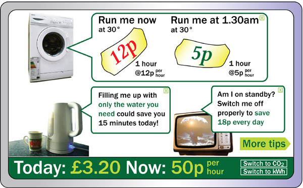
- Dan Lockton (a researcher at WMG, University of Warwick, and at Brunel University in London, specialising in design for behaviour change for social and environmental benefit) has also done some work on recommendations. For example, he produced this mock-up image (taken from an interesting 2009 blog post on "Smart Meters: some thoughts from a design point of view"):
 Dan Lockton is involved in a £580K research project at Brunel "to unearth how good design can cut energy use" called EMPOWER which may also be of interest. EMPOWER "aims to reduce workplace energy use through connecting people with energy and behavioural data in engaging ways."
 - 10:10 have an online tool called My 10:10 to help encourage people to cut their carbon emissions. Lots of pretty graphics, gamification and social stuff.